


Find Clients Webinar Replay, Post Processing for Consistency, Part Three of the Business Tune-Up


Welcome to In the Frame. I am a photographer, writer, and designer, and I love sharing my ideas, experiences, and things that fascinate me. I hope you come along and get inspired, or at least entertained. - Don
Hi everybody. I missed the Sunday Dispatch due to family coming in from out of town. But a day late isn’t too shabby.
How I use film emulation presets to keep the images I make consistent.
First of all, I do not represent any product companies, so when I mention them know that I am not affiliated and telling you exactly why I use them and how.
Camera Color Settings:
I use 5500K for all my work in the field and studio. I don’t use AWB or any other setting. I will use Tungsten if I am in a particularly tungsten-lit situation, but for most daylight and studio work, I use 5500K.
I want the experience of film, and it had no auto white balance setting.
Blue Hour sucks on AWB, so does dawn, and various other venues like slot canyons.
I also shoot Nikons and Canons for my more ‘serious’ work.
I want the images to work together.
In past lives we had Kodachrome with it’s deep reds and muted blues. We had Velvia for bright greens and piercing blues. And Agfa for a more pastel feel.
And even within brands, there were films that I loved for their look.
Fuji Fortia being one of them.
I liked the color. I can’t quantify it more than that. I simply liked the look, and would shoot it whenever I was working on personal projects.
(There were others: Fuji Velvia and Provia as well as Agfa Precisia.)
And I had freezers full of Ektachrome 100 in 35mm, 120 mm, 4x5, and 8x10.
To add to this, we had color negative films as well; Ektar, Portra, Plus, and a whole host of films from other brands. Some were pro films, and some were made for the general public. And they all looked a little bit different.
Cool.
Today I find that most cameras shoot with a decidedly transparency film look that is at once colorful, but totally uninteresting without a bit of a tune up.
So I use RNI film emulation on my work as it goes into Lightroom.
For the images I am sharing today, I used the RNI Fuji Fortia Slide Film emulator.
I use it a lot.
It tends to bring my imagery into a color palette that I am familiar with, at least it does so pretty damn well for a digital image.
I then do whatever I am going to do to the image before sending it off to Photoshop.
Let me share.
image One: SOOC.
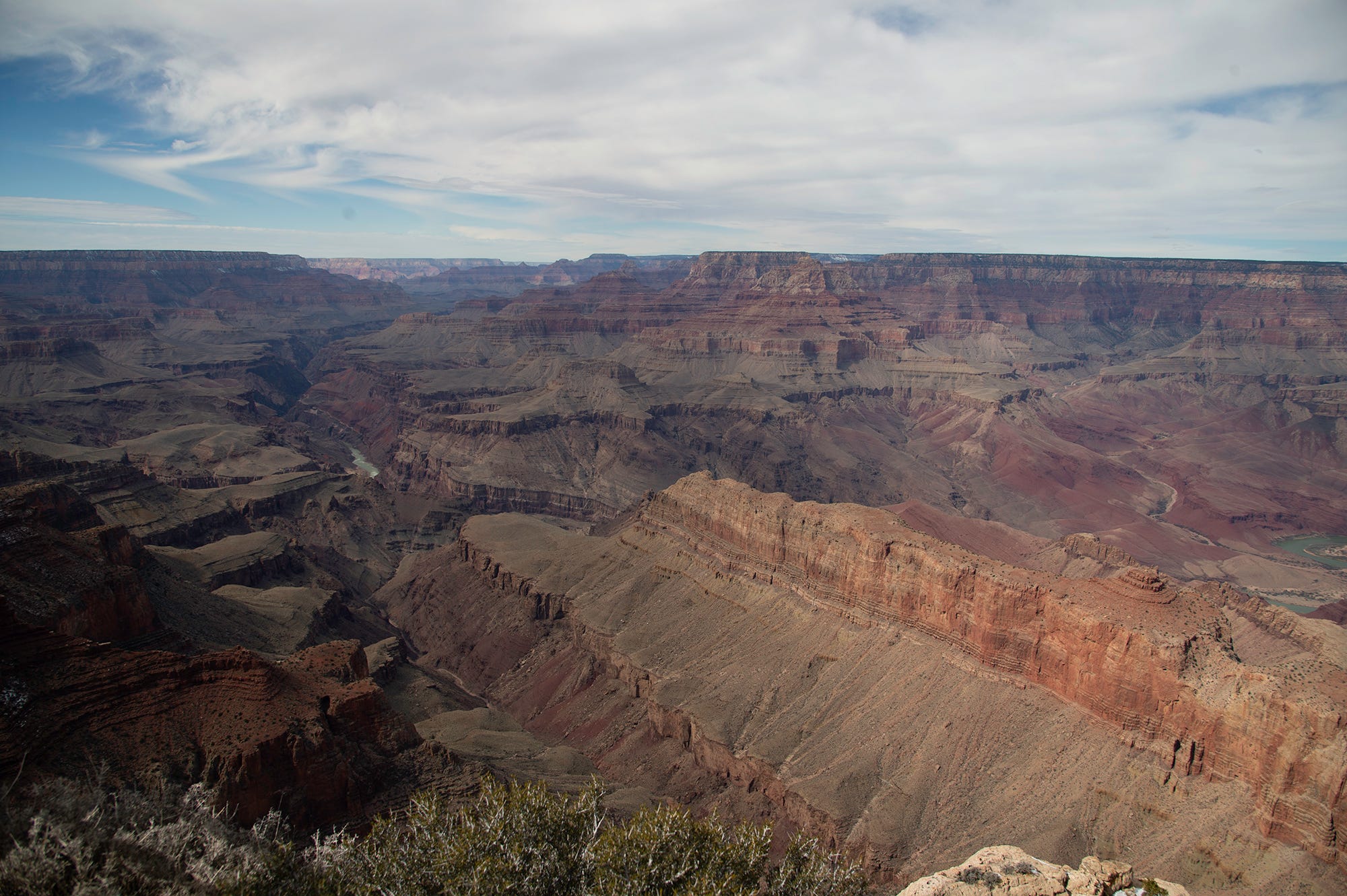
I then used the RNI Fuji Fortia preset:
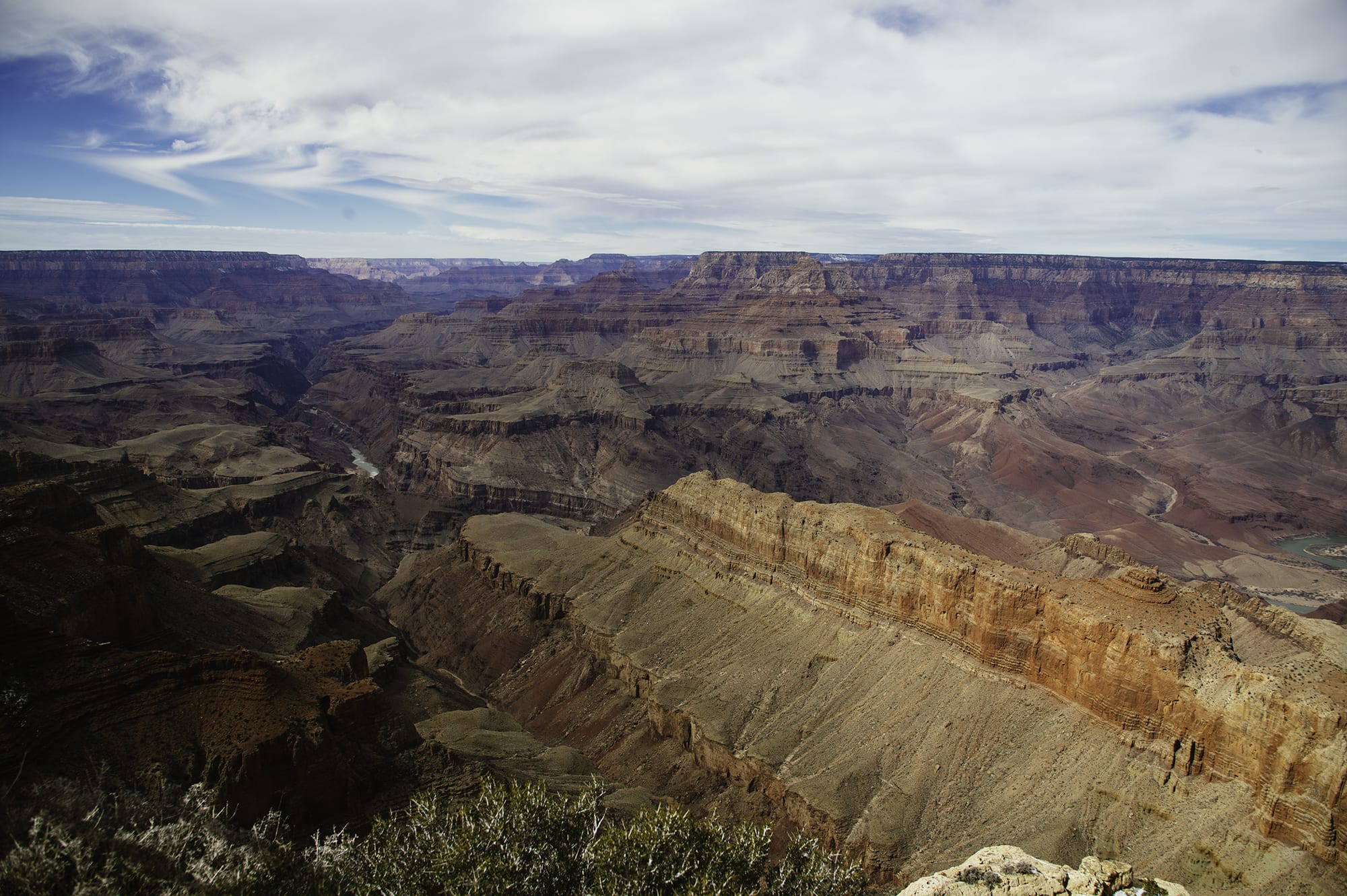
For much of the reportage work I do, I am essentially done at this point. I am not a heavy retoucher, but in this case I did want to spark it up a bit with NIK. Using the Pro-Contrast with my own recipe, I get a bit of a punchier image.
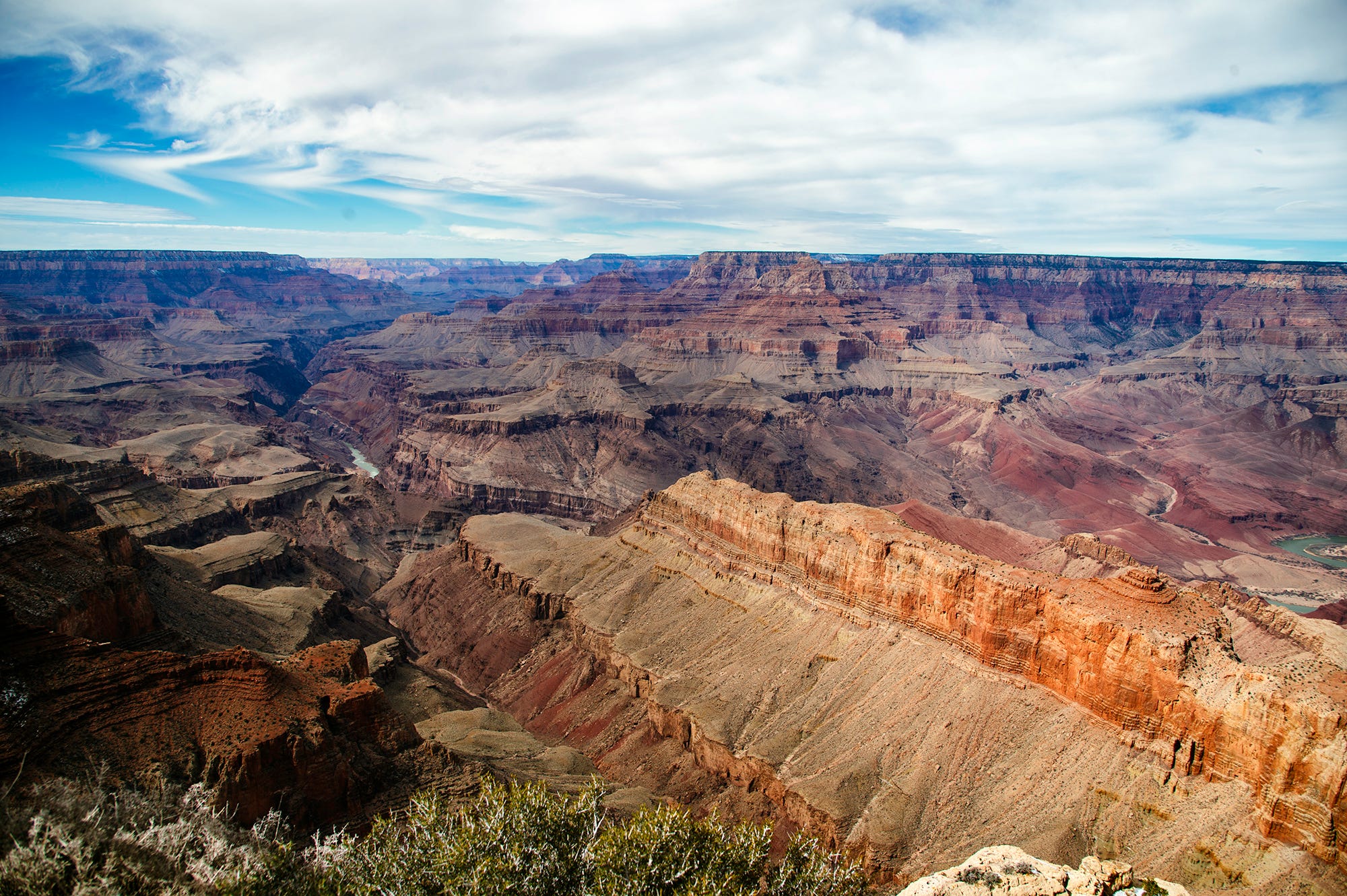
I then finish it off with some very selective, non-destructive burning and dodging along the natural highlights to get the final photo.
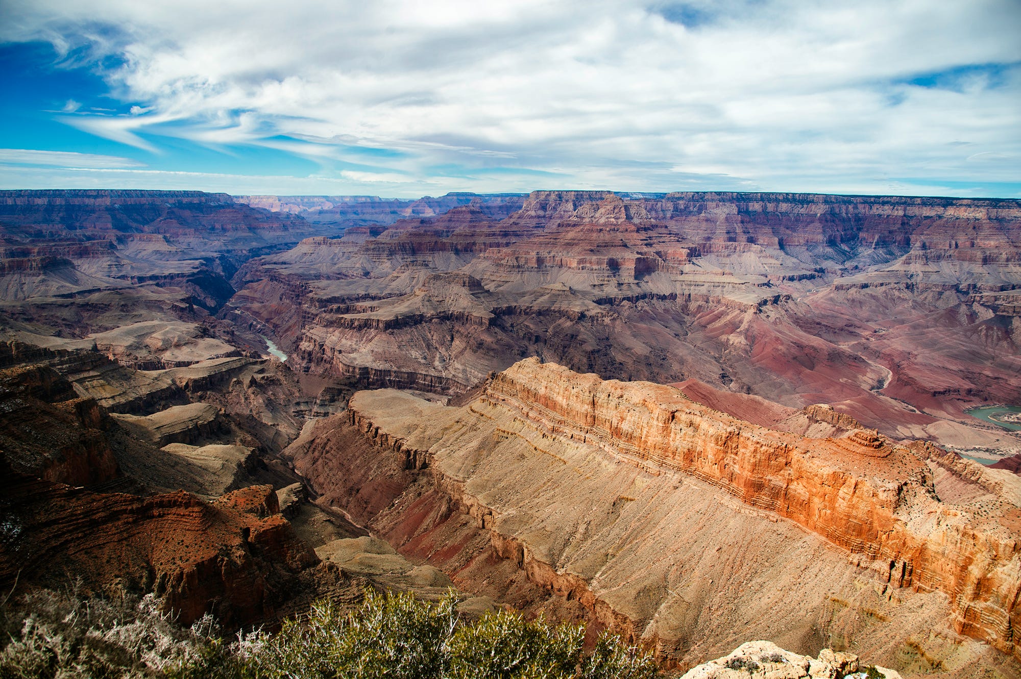
The images above were shot on a Nikon Df with a 24mm-120mm lens.
The image I end up with feels like film to me, and that look is what I am after. But what if I shoot in another area with a different camera?
These images were taken near the border of Idaho and Nevada, and very early in the morning at that.
I had my bike pulled over and sat for a few minutes, waiting for the sun to light up the mountains in the back.
This is the image SOOC.
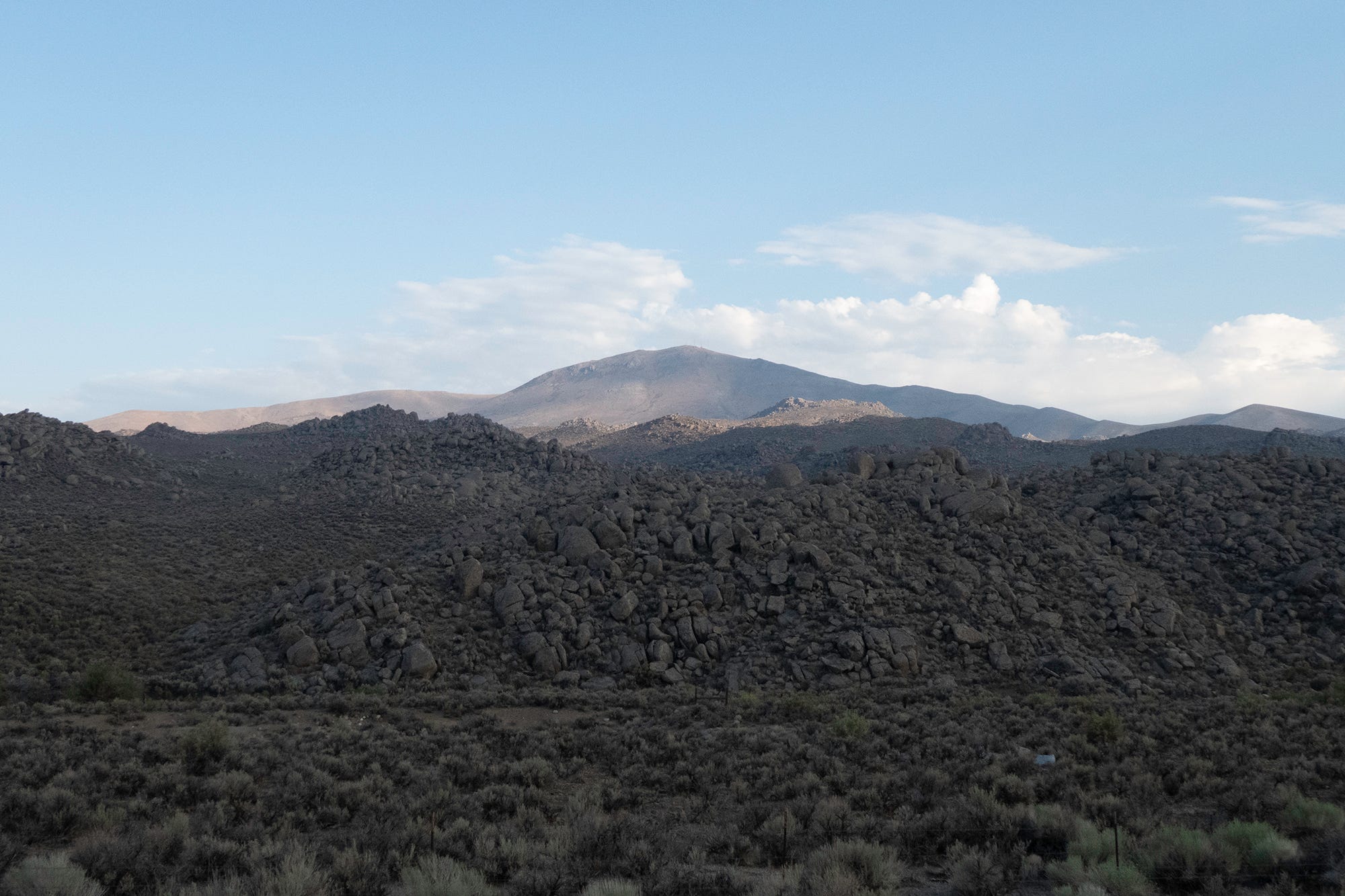
As you can see, it is a bit flat and rather boring since we cannot make out the texture and detail in the foreground.
I then applied the Fuji Fortia preset.
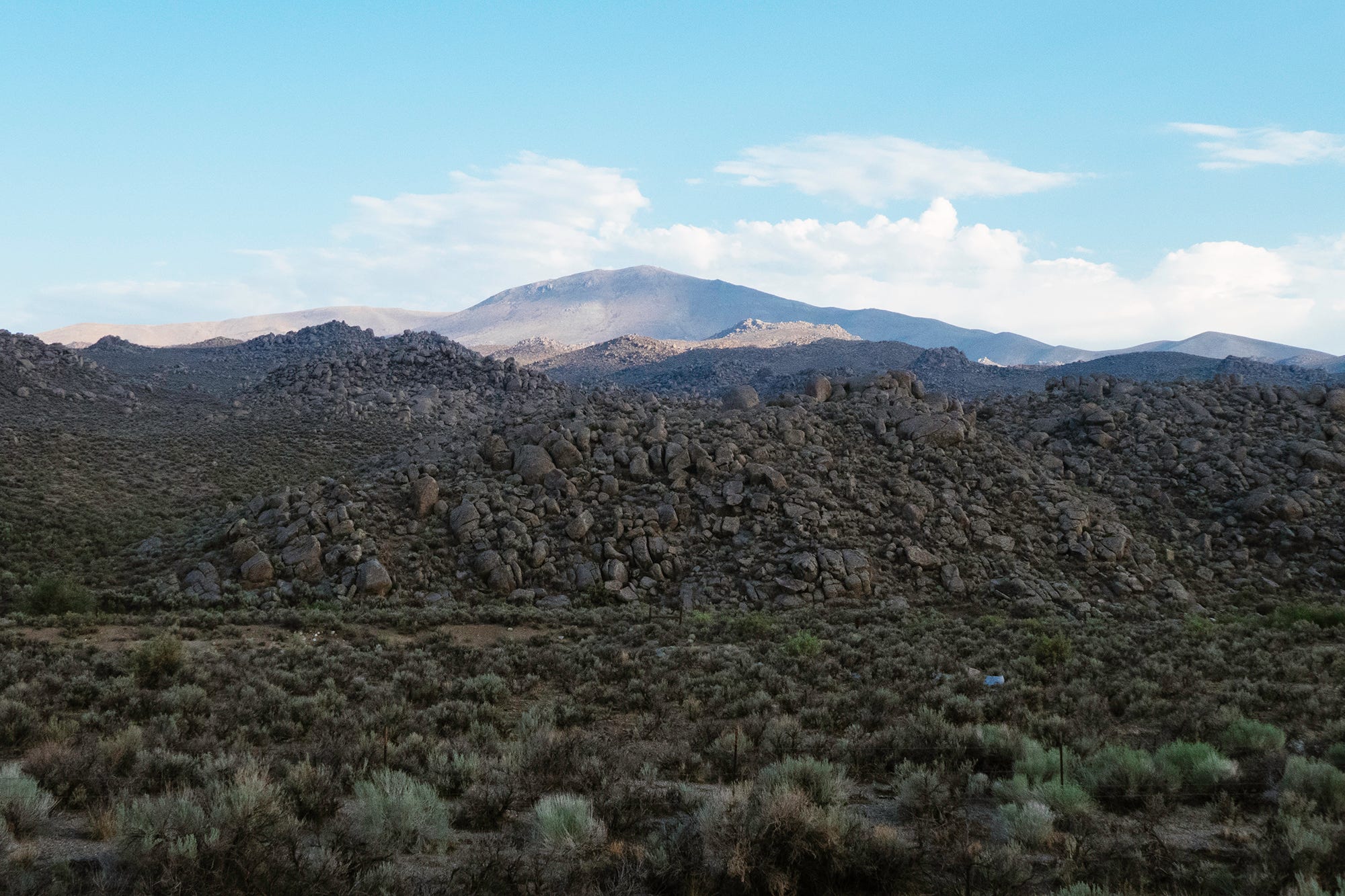
Immediately I get that Fuji sky, and there is a lot more texture and color in the foreground.
Taking it into Photoshop and NIK gives the image a bit more pop with the same Pro-Contrast and custom setting.
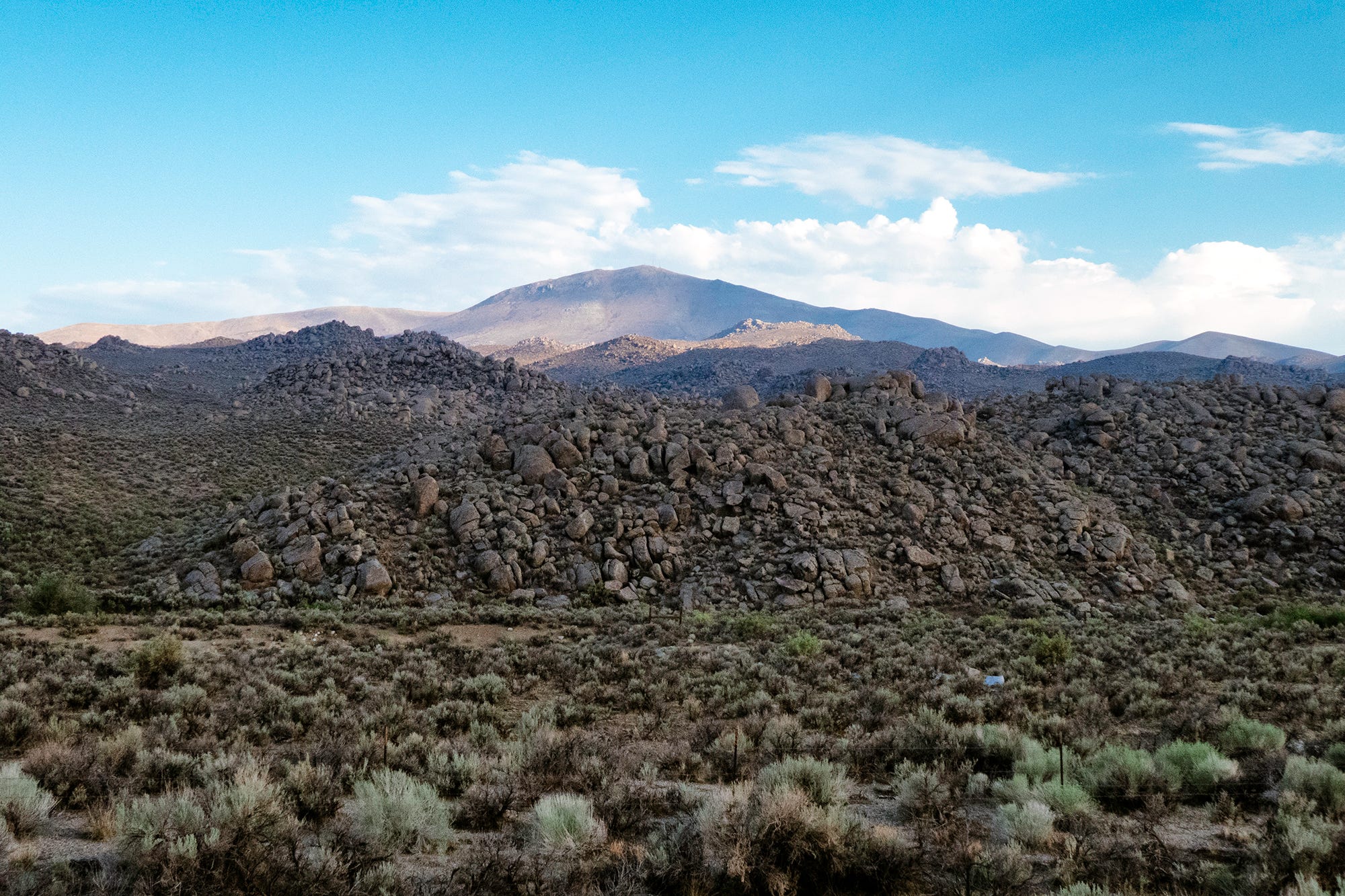
Nik gives the image some much-needed contrast.
I then use a non-destructive burn and dodge technique to give the image some local contrast and to pop the rocks along the ridges.
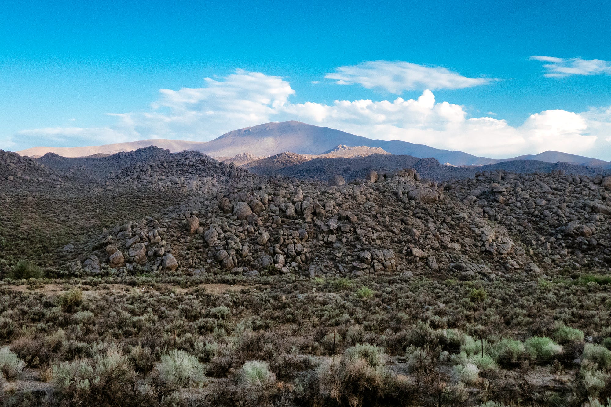
Now my blues are the same, the feeling of the color is the same as the Grand Canyon shot, and the two images can fit into my book with some confidence.
Often the kind of work I do only calls for attaching an emulation preset and being done with it. I do not do a lot of ‘shopping’ in my work, and like the images to look as photographic as possible.
In these days of AI crappola, I want my work to be clearly seen as a photograph.
Here are the two images together. They fit beautifully into the same color and feel even though they are in far different areas and very different subjects.


Not the usual subject matter for me, but working on the images for the book gave me the idea that some of you may find this useful.
THE REPLAY
Here is the webinar replay from last Friday’s webinar. We discussed how a photographer can find clients by doing a little research, a bit of soul-searching, and some focused, targeted marketing. This is good stuff you can use today.
The Sprint is the weekend of May 11, and you will be so empowered on the following Monday that you will feel unstoppable. Also available is a full portfolio review option as well as the sprint.
See you all soon.
In today’s chapter of the 15-Day Business Tune-Up, we will look at a Marketing Strategy Overhaul. This is for Premium Members. All premium members have access to this feature and more.
Consider joining and supporting this newsletter.
Thanks, y’all.

Keep reading with a 7-day free trial
Subscribe to In The Frame to keep reading this post and get 7 days of free access to the full post archives.