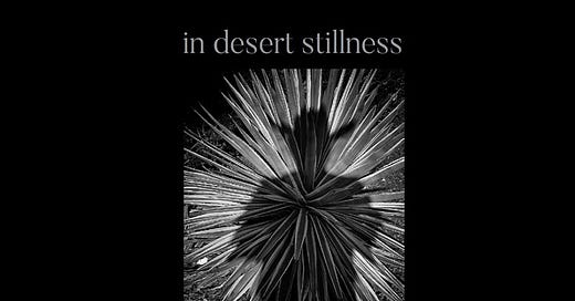
In Desert Stillness: A Book of Images From the Deserts of the Southwest
I love the emptiness of the deserts, the space to breathe, and the solitary journey.
“In the desert you can’t remember your name
’Cause there ain’t no one for to give you no pain.”
— America
I have lived my entire life in the desert. It is a part of me as sure as my hands, my feet, and what’s left of my hair.
It’s a dirty place, with sand and cactus, bugs, snakes, and varmints that would as soon kill ya as look at ya.
But it also has pickup trucks, cowboys, hats, gravel roads, and the fresh smell of creosote after a rain, and those are a few of my favorite damned things.
I ride a big cruiser motorcycle through the deserts of the American southwest and I ride alone. I take lonely roads that go to small towns with as few people as they need to run the lodges, restaurants, and Dollar Stores.
The desert is where I feel the most at home, and I have always found a beauty there that is not found in any other landscape. A quiet beauty. A still beauty. A rugged, iconoclastic, individualistic beauty that pushes at the edges, and tries without fail to seduce us into its rough-hewn glory.
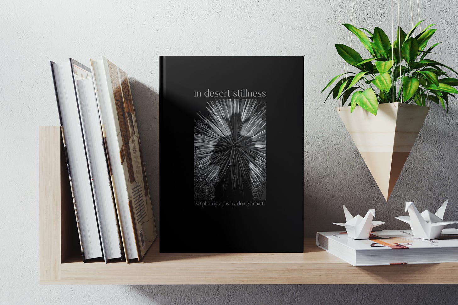
The above is the forward of my little book.
I have spent my life — so far — in the deserts of the southwest. And I would say this, without wanting to cause offense to anyone, that I am very happy to stay here, where I feel I belong. I do not have a big desire to travel all over the world. I have a very small bucket list (looking at you Valencia, Peru, and Scotland) but most of the joy I experience in traveling is in the area from the Mississippi west.
(OK, I love Maine and Nova Scotia… sue me for being inconsistent.)
I had been wanting to make another book for quite a while, and I wanted to include my desert images and have it as a reminder of the many motorcycle trips I have made with my assorted cameras.
I made a layflat book for my collection and also an 8x10 softcover book for gifts and legacy. The layflats are quite expensive but absolutely gorgeous. That said, I am very, very happy with my softcovers as well. The printing is as good as any high-end magazine.
How I put the book together:
I started with a soft edit. Over 500 images were selected for this initial pass and I used my tried and true way of whittling them down to a manageable few.
I created “contact sheets of 20 images each and printed them out at 8.5x11 on an inexpensive photo paper. I could then look at them as a group, making notes on the ones I liked and the ideas that I was working toward.
After the initial edit, I had the images down to 234 which made the cut.
And they made the cut because in the middle of the first edit, I realized I needed to say something different with this book. I wanted it to be small, only 30 images, and so it had to have a point to it.
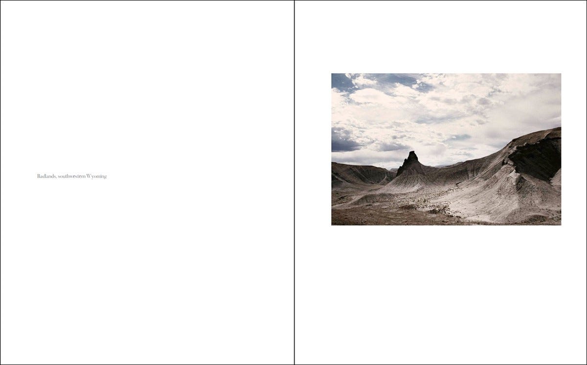
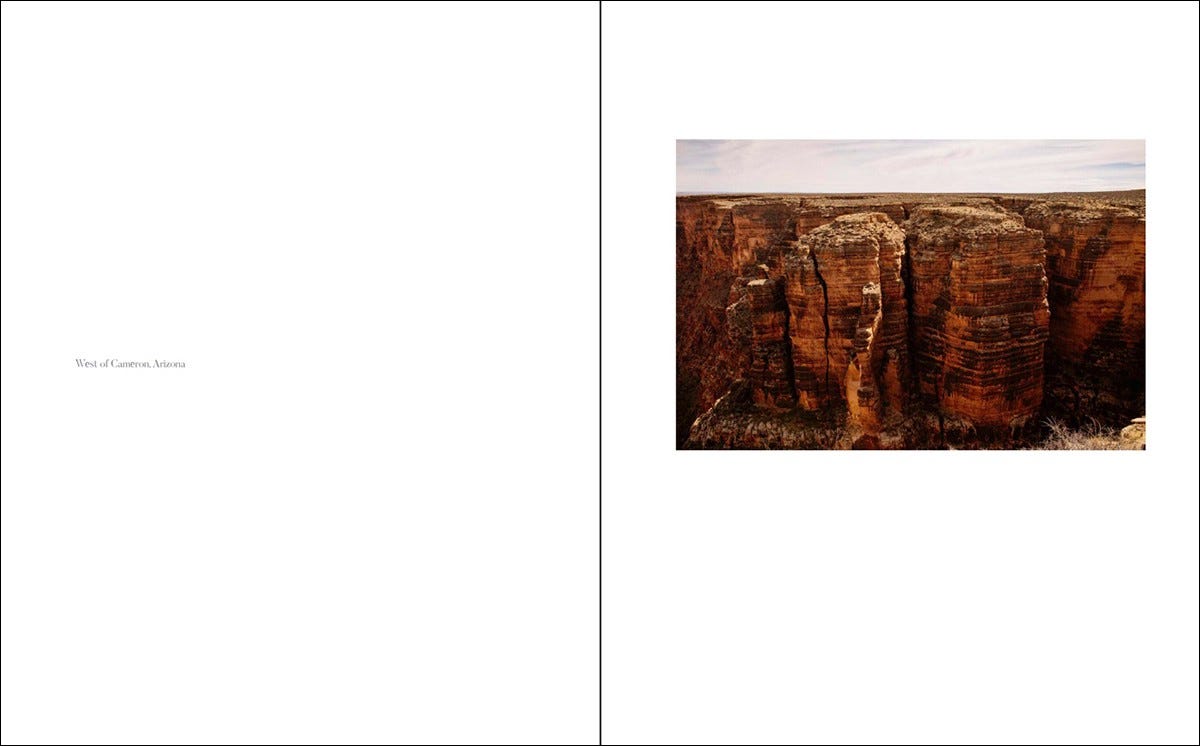
A book of desert images that said something about the world I had photographed. I didn’t want the grand images of the Grand Canyon or Canyon DeChelly. I wanted quiet, still images of a more subtle and less grand landscape than the usual highlight reels.
I wrote in my notebook: stillness, quiet, hot, sparse, lots of room… and the title came from that.
“In Desert Stillness”.
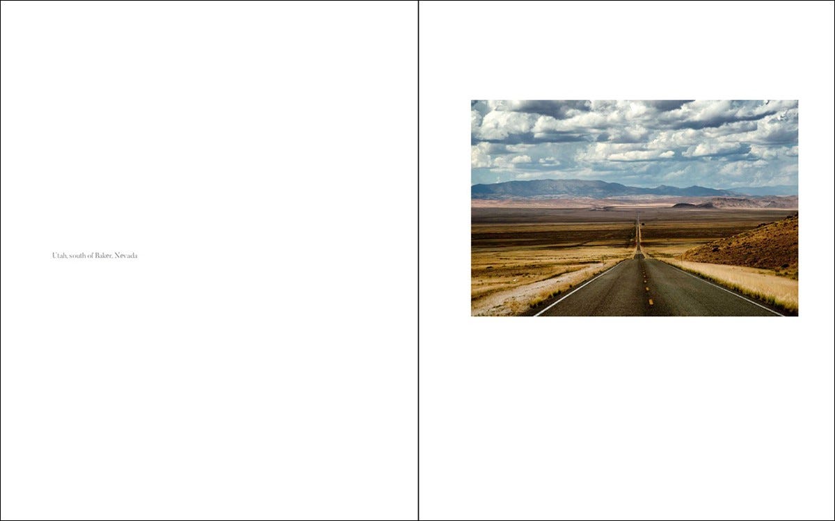
I remember roads so quiet that my ears would ring from the stillness and solitude. Hikes to places so silent, and yet stunning visually that it made me feel small.
The desert is full of incredible life and infinite beauty… but you gotta look for it. Look hard for it. And when you find it, you will never look at a desert the same way again.
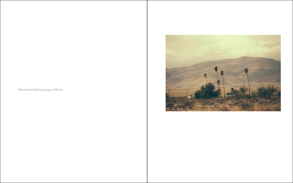
The second and third edits brought me closer to the type of images I wanted to present. Not Arizona Highways stuff, but the more subtle and softly spoken parts of the deserts I had visited on the bike.
I should note here that all of the images in the edit were shot from motorcycle rides throughout the southwest. Many of those miles were spent in the mountains so those images automatically were cut.
One more ‘final edit’ gave me 48 images. And this was the hardest edit yet. I had to kill 18 images from the book.
At that point, I moved to the design of the book.
Idea one: landscape 10x8 one large photo per spread. This seemed logical as so many of the images are in landscape format. I built a 6-page book and printed it out myself.
Meh… it didn’t have the feeling that I was going for. The photos were too big, and there wasn’t enough white space to bring the feeling of isolation, I realized, and this format would not do justice to my vision.
I then mocked up a few other ideas in the landscape format… and none of them worked for me.
Turning my format to the vertical, portrait position made the horizontal images smaller, as I had added some padding around the photos to give them space.
I knew that was working. The images looked somewhat isolated, alone, and quiet — as they were when I made the photograph.
This gave me the ability to make the few portrait-formatted photos larger. They provided contrast and a visual blast to the eye. The unexpected large photo was like a crescendo of a symphony, a sudden and loud explosion of brass and winds.
I had the layout… now the last part of it: the font selection.
Choosing a font is always a challenge, but over time I have found that I really choose from only a few options. I know there are many out there, but I return again and again to the ones I love.
For the body copy, I chose Butler. a distinct serif font that can be very strong but also very delicate when required. It seemed to be the sound of the desert applied to typography.
For the quote from America, I chose a thin display font titled “Calmer”. I like thin lines, and the ultra-roundness combined with the utterly spiny feeling in the letterforms. It gave me the right feeling for the header of the book.
I printed a cheap copy at a local printer… in black and white, and sat down with my red pen to find all the typos. I missed two… sigh. But the nice thing about print-on-demand is that you can correct the file and resubmit it.
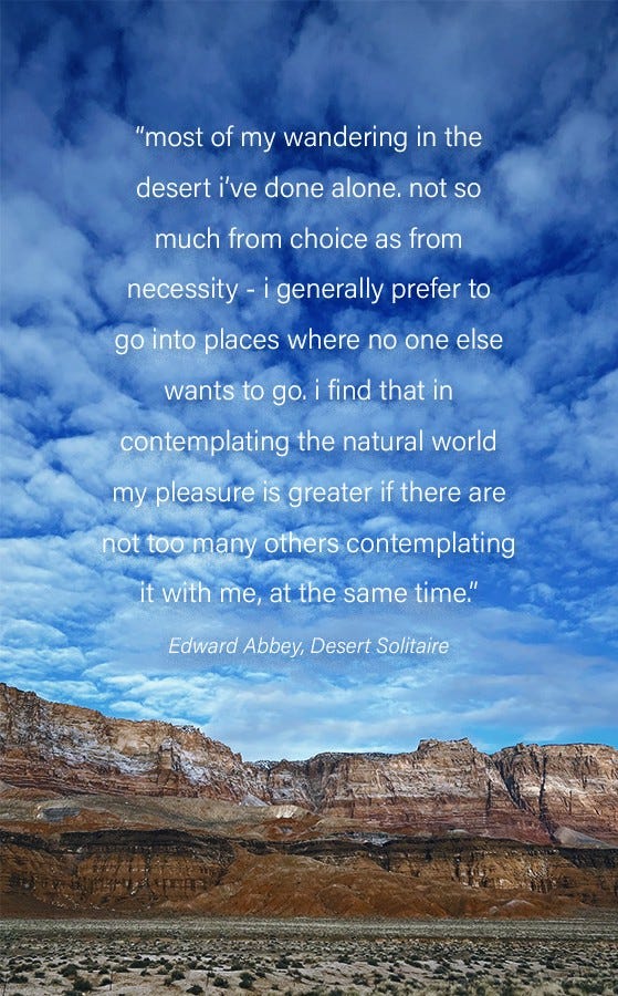
So that was the making of “in desert stillness”— a nod to one of my favorite writers, Edward Abbey (who wrote Desert Solitaire and influenced the ever-lovin’ hell out of me when I was younger). In fact, the book that made me want to take photography seriously was “Slickrock” by Edward Abbey and Philip Hyde. I lost it years ago but was able to pick up a copy recently on Amazon.
If you are thinking about making a book of your images, and you should be thinking about making a book of your images… plan it out, sketch a bit with pencil and paper, and do not rush headlong into the project without knowing what you want to accomplish with it. Is it a simple “vacation memories” book, or something you want to use to define your vision?
With all of the print-on-demand shops out there, price is no longer a real issue. You can get wonderfully printed books for the price of three lattes with double shots.
The book is available on Blurb
I am a photographer, designer, and photo editor. You can find me at my self-named website or at Project 52 Pro System (enrollment begins January 6, 2023) where I teach commercial photography online. This is our tenth year of teaching, and it is the most unique online class you will find anywhere.
Check out my newsletter and community at Substack. We are new, but growing.
You can find my books on Amazon, and I have taught two classes at CREATIVELIVE.





That's a good job!