In The Frame 7-1-2023: Your Creative Edge, and Sweet, Sweet Photos.
Happy Fourth of July weekend, now why should I hire you?
Good Sunday Morning to all of you.
This morning found me up at dawn, busily cleaning out the last remnants of some shelving we had in order to get some nicer cabinets installed. The things we collect over the years can become lost in the other things we collect. I have thrown out stuff I never thought I would part with but haven’t even looked at in a decade.
But renewal is just that.
Thanks again for being a supporter of this newsletter. The fact that someone reads it is a blessing to me. I would probably write it anyway, but your kind involvement makes it seem so much more fun.
In the stack of paper memories, I found an old set of notebooks from the very early 80s. I started to toss them, but stopped to look inside.
And immediately nixed the tossing. So many memories and ideas came flooding back in those yellowed pages of contemporaneous scribblings.
(Note: My handwriting was infinitely better then than it is now, so reading them was easier than reading my shopping lists today. Hmmm…)
I stopped at some passages I had written about an interview with a client wanting some lifestyle photography.
It was spring 1982. The client was a well-respected PR firm, and their client was a regional sportswear brand doing a catalog.
My notes:
“Kathy liked the presentation, but threw a curve. What was that? She asked me why I should be hired to do the shoot? I dunno.
What do I bring?
Steve’s promo on the table.
Assistant repeatedly wanted me to tell them what made me better.
Better?
Not expecting.
Have to call Mark and find out what’s up with that.
I don’t think my answer was good.So what makes me different?
Do I ask someone?- Liked the running shots, skipped the food, lingered on the fashion.
Call Mark, scratch 4.”
No referral.
I didn’t get the gig.
Steve was a photographer in town that I knew.
Mark was a business manager.
Note that I wrote down what they did when looking at the book.
Note that I did not ask for a referral that day because it didn’t feel right.
”Scratch 4” - I have no idea.
I was blindsided by the question, “Why should we hire you?”
It haunted me for a long time.
But it made me think hard about what to say the next time it came up.
And it did on many occasions, although often it wasn’t spoken in those particular words.
In my photography business, the ad agency, or the media company that came last, I tried to explain why I should be the one ahead of time.
Today we have social media, email, YouTube, and a thousand other ways to answer the question beforehand. And that is great.
But be prepared for it to be asked anyway.
Because it will.
Have you ever asked yourself “Why me”?
Could you tell someone why they should choose you to do the work rather than that other guy with the shiny car and super-megapixel-mega-camera? Can you explain the value that you bring to anyone who asks?
Can you articulate a business case and an artistic case to make them feel more comfortable hiring you?
You should be able to do that, you know.
If you cannot explain it to a potential client, they may not be able to see it on their own.
When you feature your uniqueness, no matter how small, you step away from the crowd. The crowd is too noisy to make yourself heard. Like a violin in the middle of a marching band, you blend in behind the blaring of the trumpets. And there are always too damn many trumpets.
A simple, unique quality, be it style, wit, charm, point of view, approach to timeless photographs, or simply a body of work that enlightens the viewer and surprises them – even a little bit – can drive the interest of clients.
Let’s say your message resonates with them. That’s a good, creative word that means, “Hey, they get it.”
And when they get it, they get you.
That builds trust, and trust builds credibility, and credibility is the currency of commercial art. Establishing yourself as a trustworthy, and fully credible artist, is one of the most important things you can do as a freelance creative.
We call this your brand.
Now, I’m not going to go off on the word ‘brand’. It is overused, exploited, and chockful of bullshit.
But there is also a deep level of truth in how powerful it can be.
It is not your logo, your color palette (I’m a summer – who gives a damn? ), or what typeface you choose for your printed material.
(Unless you choose Comic Sans. If you choose Comic Sans, you should immediately seek a warehouse position with Walmart until and only until you recognize the error of your ways. I know you can.)
But that is not to say your visual identity is unimportant. It absolutely is.
As a visual artist, what you do visually makes a huge statement about your credibility.
How can you say you are a great visual artist if you choose Comic Sans, have a layout that is wonky as hell, and choose colors that make people’s eyes bleed?
Bleeding eyes is never a good sales tactic.
A consistent visual style across all media is critical for playing the long game in this business.
A color palette, a font choice, and a clean and easily recognizable logo are all important.
(That said, your logo, font choice, and style of correspondence, are not what clients are looking for. It is far more important to execute and get your work in front of people instead of freaking out about the line spacing of a mailer. Geeeezzz, people. Priorities!)
I suggest getting your visual branding done quickly. Whether it is a good 5-star-rated designer on Fiverr or a local designer you do a trade-out with. Tell ‘em what you want, have them execute a good one, and move on. Quickly.
Too many photographers spend too much time on this stuff.
If you have great images, there ain’t a single client who is going to say “Wow, her work is exceptional. I really wanted to hire her for this cool gig. But I noticed the kerning in her logo was a bit too tight. And that shade of orange is three units of red too much.”
C’mon, man, nobody cares that much.
Personal opinion:
Leave the logo graphic alone. Just pick a great typeface for your logotype and be done with it. A wonderful place to find a good typeface is Creative Market. Spending a few dollars on a logotype will put you in a very small group at the top of the list of brands. Most photographers go to the free fonts at Google.
Now let’s look at some exercises to help you find ways to get to the heart of what you need to know.
Reflect on your strengths: Consider what skills, techniques, and qualities set you apart from other photographers. Are there things you can do to augment your strengths?
Make a list of what you do well.
Make a list of what you do fairly well.
Make a list of what you don’t do well.
Make a list of what you do poorly.
Wow. Helluva list, eh?
We can use this to help us prioritize what to work on, what to focus on, and what we can do to polish up those third and fourth lists.
Now take some time to define your niche. Are you a people photographer, a food photographer, a landscape photographer, or a product photographer? And the subsets within those areas are deep.
Perhaps you have something you do that is unique.
What is it, and how well do you do it?
Consider your values and what you are, indeed, passionate about.
Do they fit in with your niches? Are you passionate about what you shoot? If so, that is called harmony. If not, that is called dissonance.
We gotta make a great-sounding chord here, so harmony is what we want to achieve.
Look, really look, at the above. Do these things all combine to help you understand your brand?
Your passion, your uniqueness, and your visual statement all contribute to what others think of you. It is what they see when they see you and your work.
They recognize your passion through your work.
At this point, you have found your brand.
And your brand, what it means to you - and to them - is what tells them why they should hire you.
The same exercises you do to create your brand are also the exercises to find your uniqueness, your aesthetic, your style.
Those are what you bring to the shoot.
Adding in the business acumen, customer customer service, and winning personality, and you are ready to answer the question.
“Why should I hire you?”
"Your project deserves an artistic approach, and my 20-years of experience in this field have honed my craft into fine art. I don’t just deliver images, I deliver stories - your stories."
"Quality is my non-negotiable. From the lighting to the post-production, every aspect of my work is aimed at delivering a superior product. Just the right approach you need for this job."
"I'm not just a photographer; I'm your visual partner. I care about your vision as much as you do, and I'm totally committed to making it a reality."
"I have a proven track record of national and regional clients, and my experience spans a wide range of styles and settings. You need versatility with consistency, and that's exactly what I bring."
"Outstanding customer service is my base standard. I'm here to make the process smooth, efficient, and enjoyable for you."
Different answers for different client situations. Someone may be needing simple product shots, and you may use something to allay their fears of working with someone they don’t know. Other clients need an artist to help them bring their work forward.
You will have to hone your skills at asking questions yourself so that you can craft the best response.
And while your photography, that is to say, your portfolio, is the most logical extension of your brand there is, knowing what to say along with it is equally important.
Do the work.
Research your own images and make notes. Careful notes.
Do the exercises above.
If you do, you will be ahead of almost every other photographer - at least in knowing the answers to questions that may be asked.
You will be prepared.
Most photographers will not do this.
But in the end, it is up to you.
So, why should I hire you?
An Ode to Chocolate
One of my favorite assignments for Project 52 was the chocolate assignment.
Photographing chocolate is both technically and aesthetically challenging. The nightmares of touching the chocolate, dropping it, bumping it, maybe looking at it wrong… and the resulting retouching… AAARRGGHH.
Plus, how do you shoot it in a way that hasn’t been done a million times?
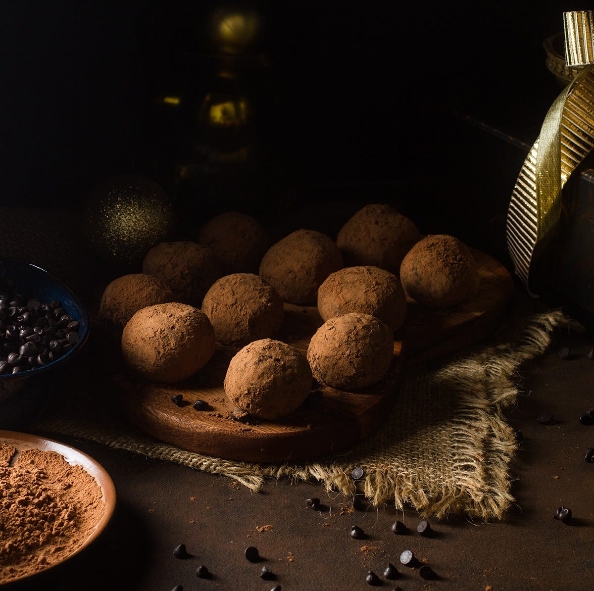
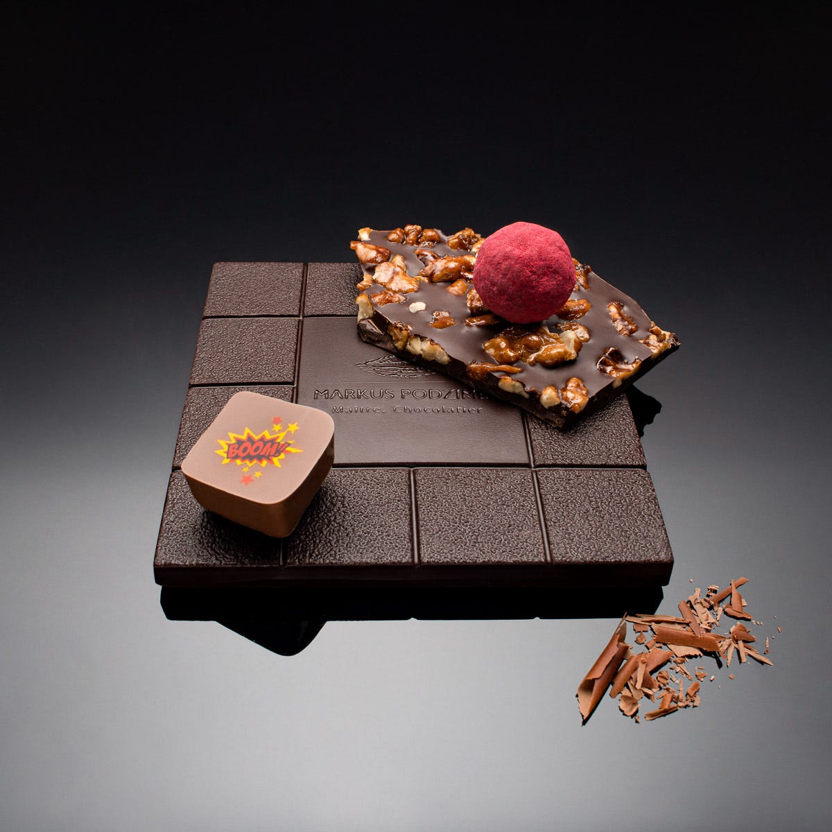
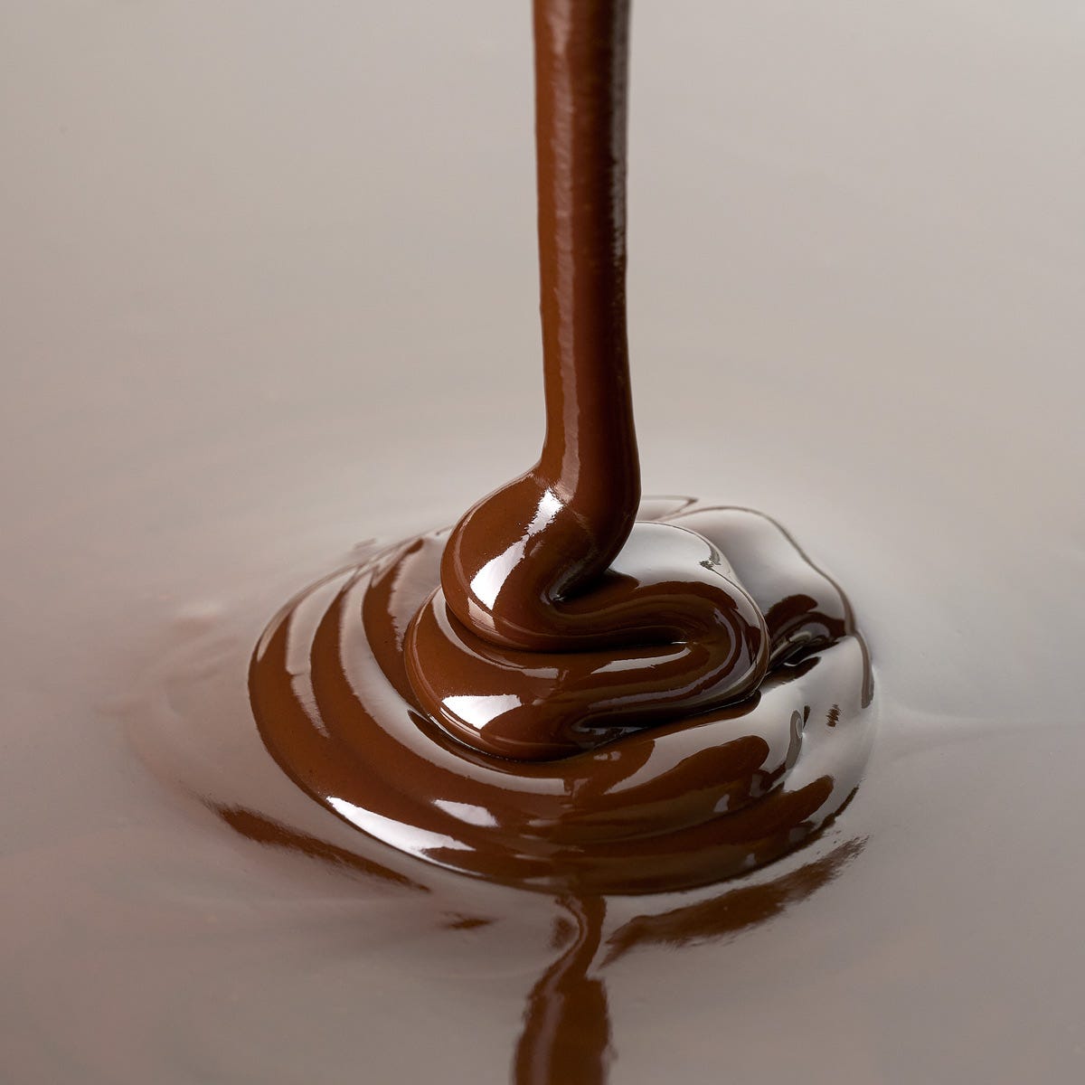
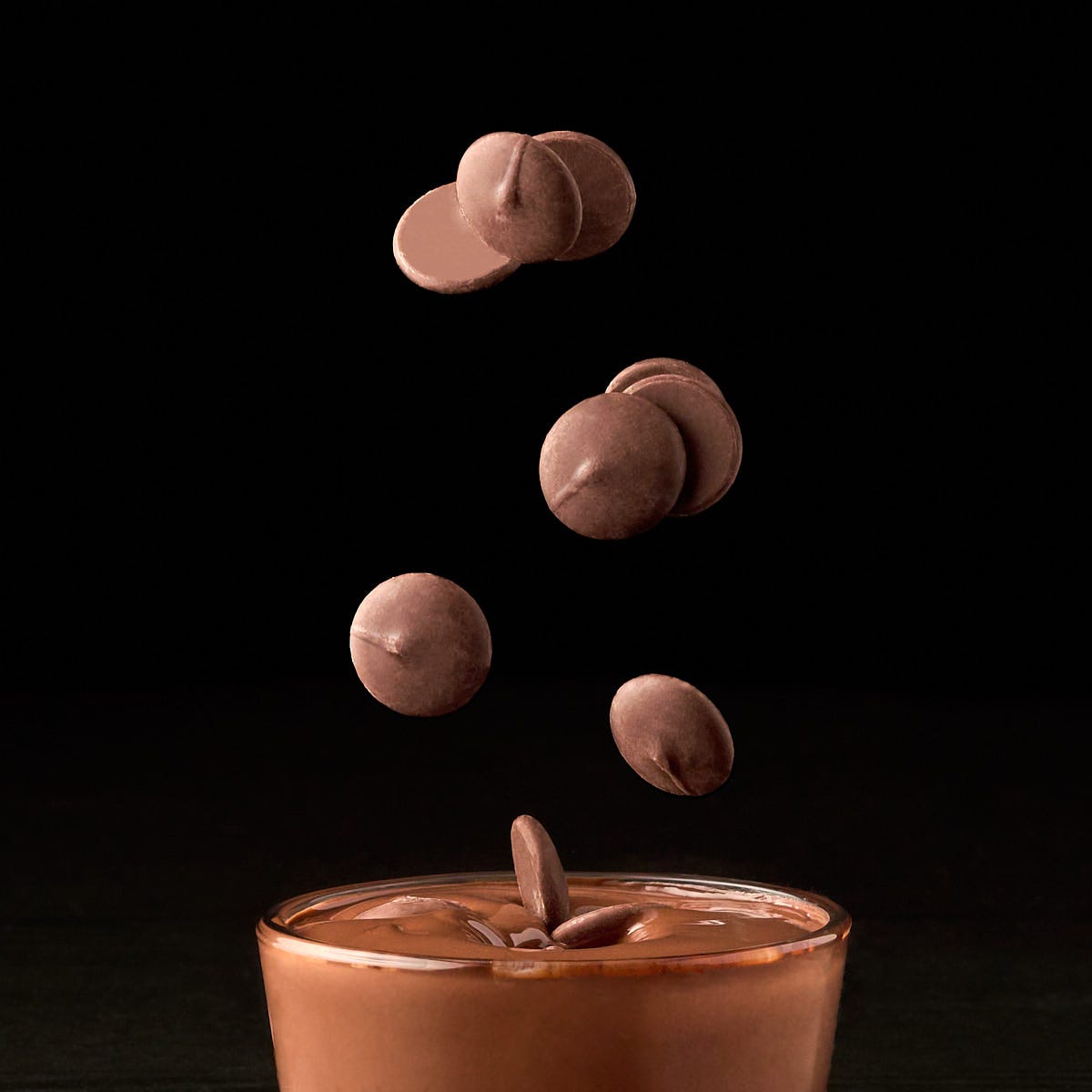
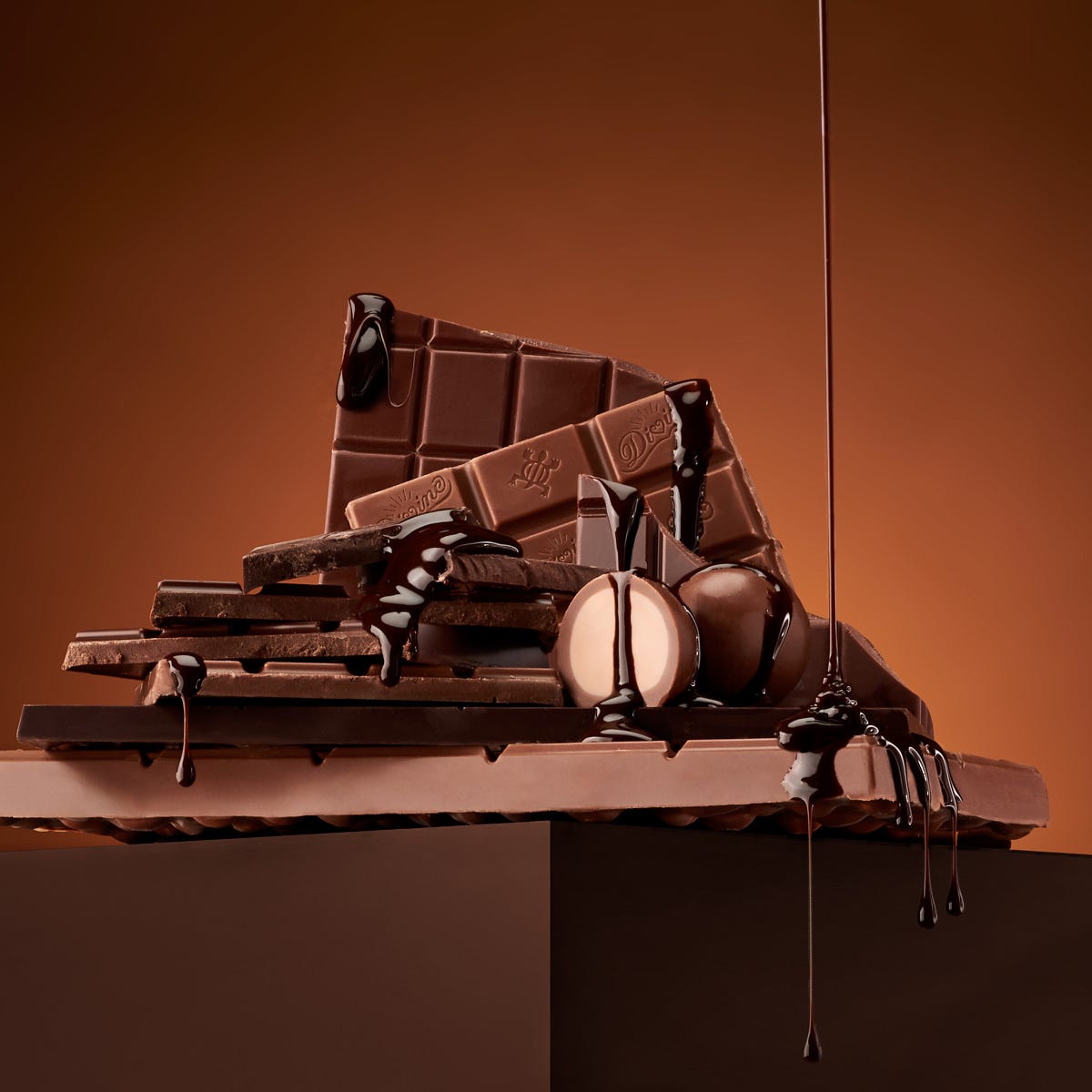
I want to share some of the student’s chocolate shots that did just that. Beautiful work from talented photographers.
First up is one of the all-time best chocolate images I have ever seen. Created by photographer Sam Breach, the image is a stylistic and artistic wonder. Sam generously shared her work and the behind-the-scenes information on the creation of this masterpiece.
Next is Barbara Schweighauser’s beautifully styled chocolate still life.
Hopefully, your teeth are not hurting and you haven’t gained 18 pounds from looking at all of these sweet treats.
I will miss giving this assignment and reviewing the amazing photos that always emerge.
Thanks to all of my subscribers. Consider the premium edition. We do a lot there including Legacy Project 52 Assignments.
We’ll talk soon.

