
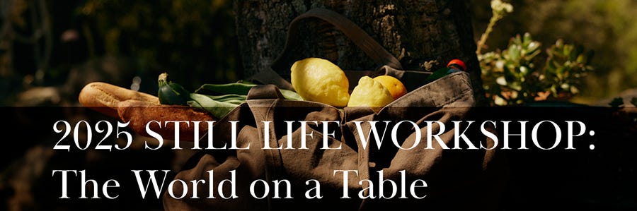
Twenty Assignments to Build Your Portfolio: #3 Perspecitive and Scale
These idea will work on all types of subjects.

This is part two of a 20-week workshop. The assignments will be given on each Monday until the end of the year.
I hope that they will get your creative juices flowing, and inspire you to build images and your portfolio. Imagine having twenty (or more) new images for your book by January 2026.
Scale and Perspective
When we talk about scale in photography, we’re talking about how much of the subject fills the frame. A tight macro of a product detail is a completely different scale than a pulled-back shot that shows the product in its environment.
Both are valid, but when you put them side by side in a catalog, magazine page, or advertisement, scale is what gives the page rhythm.
Four shots at exactly the same size and distance feel flat and repetitive. Mix close, mid, and wide, and instantly the page feels alive.
Even if every photo has the same background and lighting.
Perspective is simply where you put the camera. A straight-on product shot at eye level feels objective and informative, a classic catalog style.
But drop the camera a bit for a low angle, or move above for an overhead, and you’re changing how the viewer relates to the product.
Perspective adds variety and mood while still showing the viewer what you want them to see.
It’s how you keep the layout engaging while still presenting a unified set.
In this assignment, you’re using scale and perspective to create variety within consistency.
I don’t want you shooting four random images. I want you to think like you’re building a page of images.
That means every shot needs to share the same light, color treatment, and background, but within that consistency you’ll shift scale (detail vs. full product vs. context) and perspective (front-on, angled, overhead) to keep the page visually interesting.
Think of it like a band: all the instruments are playing the same song, but each one brings a different range and tone.
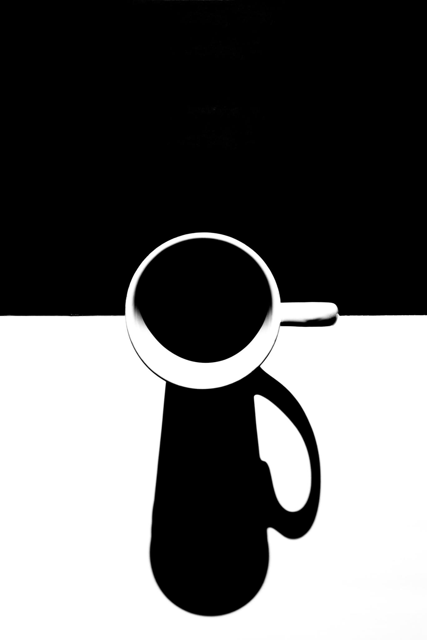
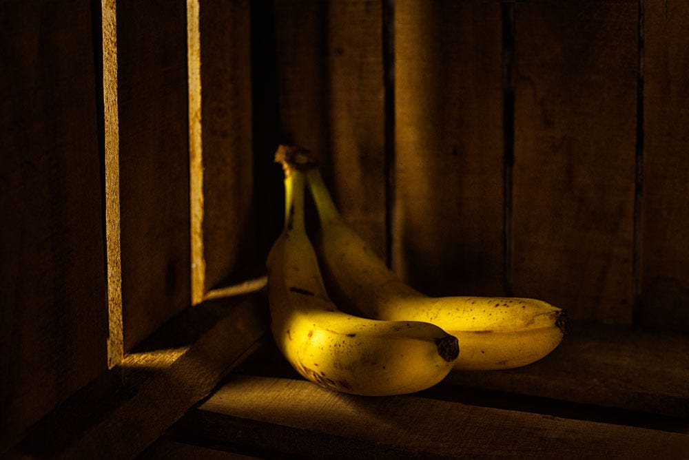
The two images below, by Janice Eddington, show how the presentation changes by the perspective of the camera:


Aimee Armour shows how the product remains the same, but is presented in a totally different feel by changing the perspective.


Scale Play
Get in close.

Concept:
The images should feel dynamic, not flat. By shifting scale and perspective while keeping lighting, color, and surface consistent, you create rhythm across the layout. Think of it like a song: verse, chorus, bridge—different but in harmony.
Here are some images brought in close. This unusual scale attracts the eye because we usually don’t see these things so close. That makes it more unique and lets the eye move through the image with a bit of wonder.


(NOTE: I have used food for the examples, but you can use any product you wish. Try it with bicycles, electronics, or kitchen appliances.)
Shot Breakdown
1. The Hero Close-Up (Detail Shot)
What to shoot: A tight crop of the product’s most tactile feature—texture of leather, condensation on a drink, stitching on fabric, or the shimmer of packaging foil.
Purpose: Draws the viewer into the sensory quality of the product.
Example: For a bottle of olive oil → a macro shot of golden liquid catching light through glass.
2. The Mid-Range Classic (Product in Context)
What to shoot: The “straight” product shot, framed head-to-toe but styled cleanly.
Purpose: Establishes what the product actually looks like; anchors the page.
Example: Same olive oil bottle standing upright on the chosen surface, label facing clean, with consistent lighting.
3. The Wider Lifestyle Touch (Implied Use)
What to shoot: Pull back to include a prop or environment hinting at how it’s used. Keep it minimal—don’t build a full ad.
Purpose: Suggests scale and use without breaking catalog discipline.
Example: Olive oil bottle next to a small breadboard with sliced bread—still clean, still catalog, but with context.
4. The Overhead (Graphic Variation)
What to shoot: A flat-lay or slightly overhead shot. Works especially well if the other three are shot at table-level.
Purpose: Breaks the monotony of angles; adds a “designed” feel to the page.
Example: Olive oil bottle with a bowl of dipping oil and a knife, shot from above against the same surface or paper backdrop.
Cohesion Rules (Non-Negotiables)
Lighting: Same direction/softness across all four.
Surface/Background: Identical in every shot.
Color Treatment: Consistent WB and post-processing.
Energy Level: If the props are minimal in one, they must be minimal in all.
Visual Flow in the a Layout (Possibly a catalog or web page)
Tall Image = Mid-Range Classic (anchors the page).
Two Squares = Close-Up + Overhead (variety without chaos).
Medium Tall = Lifestyle Touch (secondary anchor).
Here are a few ideas for your shoot:
1. Food Product (e.g., Olive Oil, Jam, Coffee)
Close-Up: Tight detail of the product’s texture (oil glow, jam glisten, coffee grounds).
Mid-Range Classic: Bottle/jar/bag upright, clean label, full product in frame.
Lifestyle Touch: Product next to minimal use cue (slice of bread, spoon, small cup).
Overhead: Flat-lay with product plus one prop (breadboard, saucer, or herbs).
2. Skincare/Beauty (e.g., Lotion, Lipstick, Soap)
Close-Up: Detail of texture (cream swatch, lipstick bullet edge, soap emboss).
Mid-Range Classic: Full product standing cleanly, label square to camera.
Lifestyle Touch: Minimal prop cue (rolled towel, water droplet, flower petal).
Overhead: Flat-lay of product with a simple repeated element (stones, leaves).
3. Small Object (e.g., Sunglasses, Watch, Jewelry)
Close-Up: Tight crop on texture or design detail (hinge, crystal, engraving).
Mid-Range Classic: Full object centered, product clearly visible.
Lifestyle Touch: Simple context (watch on a folded shirt, glasses next to a book).
Overhead: Object plus minimal styling (rings in circle, watch laid flat).
4. Tech Accessory (e.g., Earbuds, Phone Case, Mouse)
Close-Up: Macro detail of material, texture, or button.
Mid-Range Classic: Full product clean, no distractions.
Lifestyle Touch: Product with a hint of use (mouse with a notebook, earbuds coiled).
Overhead: Graphic layout—product plus cord or case arranged as design elements.
See you next Monday with Assignment Four.
The new workshop starts September 3, 2025. More information here.
TRANSFORM YOUR MARKETING
And get clients on board fast.
It’s time to get serious with your business. Photography as a business is a marketing and sales game, and if no one knows you’re out there, the images you make are not important at all.
Find out how I can help, and help fast, here.

If you’re over 40 and still hungry to make, build, and create, stick around. This space is for people who aren’t done yet (and never will be). I’ve got five decades of wins, failures, comebacks, and creative battles under my belt, and I’m sharing everything that still works—and burning the rest.
No fluff.
No hustle porn.
Just real tools for building a creative life on your own damn terms.